
Getränke Hoffmann Digitalization Initiative
Getränke Hoffmann, a leading beverage chain in Germany with over 455 stores and 50 years of market presence, is expanding into Austria and embarking on a digital transformation journey. To support this growth, the company is developing in-house digital solutions, including cash register software, warehouse management applications, and shop displays.
Our product team focused on redesigning the cash register system as part of the larger Filial Portal initiative. Key contributions included:
-
Sitemap Redesign: Rebuilt the cash register sitemap to incorporate new Filial Portal features.
-
Design Exploration: Improved information architecture and explored new layouts and styles.
-
User Testing: Validated initial designs through usability testing.
-
Core Features Delivery: Provided the first version of key features with a complete design handoff.
This project set the stage for a modernized retail experience and supported Getränke Hoffmann's ambitious growth plans.
Site map redesign
The first area we addressed was revisiting the cash register sitemap. Our primary objectives were: first, to integrate new features introduced by the Filial Portal and streamline how users navigate them; and second, to eliminate redundancies in steps and functionalities that were complicating the existing cash register system.

Design exploration strategy
In our design exploration, we prioritized maintaining the core structure and mental model of the old cash register system. Since most users have relied on this software for over 20 years, a drastic change could disrupt their workflow. Instead of a complete redesign, our approach focused on modernization while preserving familiarity.
-
Preserving Familiarity: The main layout and key elements were intentionally kept to ensure users could navigate the system without a steep learning curve.
-
Minimizing Disruption: By retaining essential functions in their expected locations, we reduced cognitive overload and made the transition smoother.
-
User-Centered Modernization: Rather than forcing users to relearn, we enhanced the interface by improving visual clarity, usability, and efficiency.
-
Optimized Usability: The updated design refines workflows, making interactions more intuitive while maintaining the reliability of the existing system.
This approach allowed us to modernize the interface while ensuring a seamless transition for long-time users.
Old cash register

Design proposal
Information Architecture
When crafting the new proposal, we incorporated widely recognized UX and UI patterns from other digital products to improve usability. Examples include:
-
Adding a main menu bar on the lateral sides.
-
Placing a search bar at the top of the screen for intuitive product lookups.
-
Introducing product cards for better visual organization.
-
Using sliders to adjust quantities more efficiently.
-
Relocation of features to more intuitive to use areas such as, product quantity edition, product return, price.

We also eliminated redundancies.
A prime example was the product search functionality, which previously had three different access points. In the new design, this is streamlined into a single search bar, simplifying the process and improving efficiency.

Styles exploration
Color, fonts and themes
One of the primary goals of the redesign was to create a product with a more modern and visually appealing look and feel, ensuring it was both aesthetically pleasing and more accessible. Additionally, the design needed to align with the company's corporate identity (CI). The exploration included several directions: the first was determining whether a light mode or dark mode would be more convenient for users as a starting point. Other explorations focused on experimenting with the use of shadows and light to add depth, while some followed a flat design approach for simplicity.

Color exploration
A significant challenge was reimagining the use of the company's colors and fonts in a digital context. To enhance accessibility, we proposed introducing additional color variants to improve contrast and meet usability standards.


Fonts
Regarding typography, we recommended deviating from the corporate font to prioritize readability and ergonomics. Our suggestion was to use Open Sans, a Sans Serif font known for its accessibility, clarity, and high readability, making it a better fit for the digital product.
Final designs
Old vs New Designs
Before


After


Prototype 1
Login, Verkauf (Sales)
To test the process of logging in and making a sale simultaneously, we created a scenario where the user needs to cash out and sell the first product of the day before logging in.
Login Process
-
Enter credentials, including the Kassier number and password.
Sales Module Steps
-
Product Selection:
-
Scanning: Add items via barcode scanner.
-
Search Bar: Lookup by product name or category.
-
-
Editing & Deleting: Modify quantities or remove items easily.
-
Quick Quantity Entry: Set a default quantity via the virtual keyboard for faster input.


Prototype 2
Filialwirschaft
This prototype demonstrates how to access and use the Stock Management Section, focusing on creating and managing orders.
-
Creating an Order
-
By Provider: Organize and place orders based on supplier-specific product availability.
-
By Product: Directly select products to streamline the ordering process.
-
-
Functional Highlights
-
Selecting the Provider: Easily choose a supplier from a predefined list.
-
Setting the Date: Assign a specific delivery or order date for better scheduling.
-
Adding Products: Call products using intuitive search or selection tools.
-
Setting Quantities: Define the exact number of items to be ordered with ease.
-
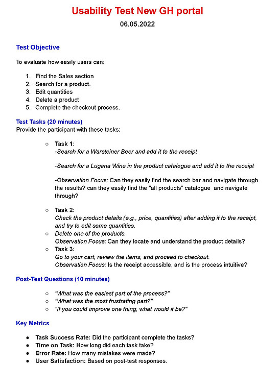
Usability test
Sales section
The expected outcome was to identify pain points in search, navigation, and checkout processes to enhance the overall user experience.
Conclusion
The redesigned GH Portal offers a smoother, more intuitive UX, enabling users to complete tasks like finding products, editing quantities, and checking out more efficiently. Users praised the modern, accessible design, making the portal more enjoyable to use.
This project also initiated a design system (DS) that has scaled components to other GH products, including the website and product display screens.